ESP
Tuvimos el privilegio de estar a cargo del video de presentación de la nueva tipografía de Baloise, una destacada compañía multinacional suiza de seguros. Este proyecto representó un desafío emocionante y una oportunidad única para el estudio, permitiéndoles demostrar su habilidad en crear narrativas visuales impactantes y elegantes.
Tuvimos el privilegio de estar a cargo del video de presentación de la nueva tipografía de Baloise, una destacada compañía multinacional suiza de seguros. Este proyecto representó un desafío emocionante y una oportunidad única para el estudio, permitiéndoles demostrar su habilidad en crear narrativas visuales impactantes y elegantes.
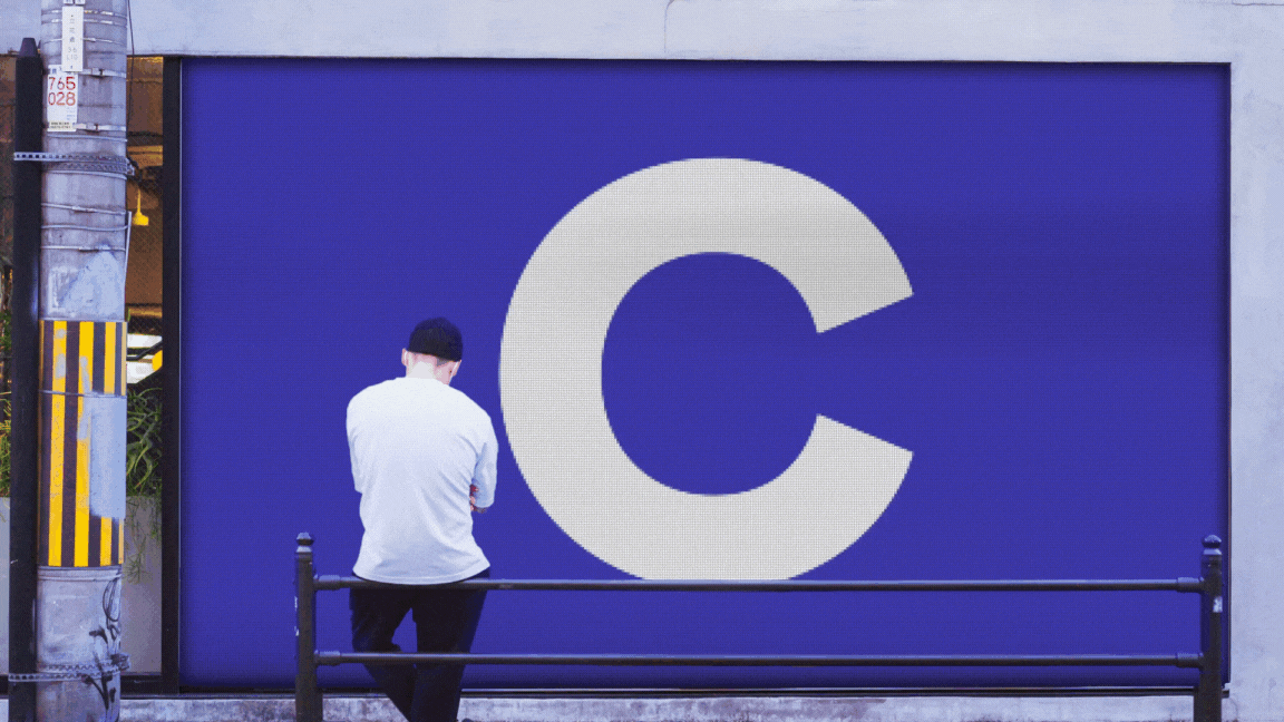
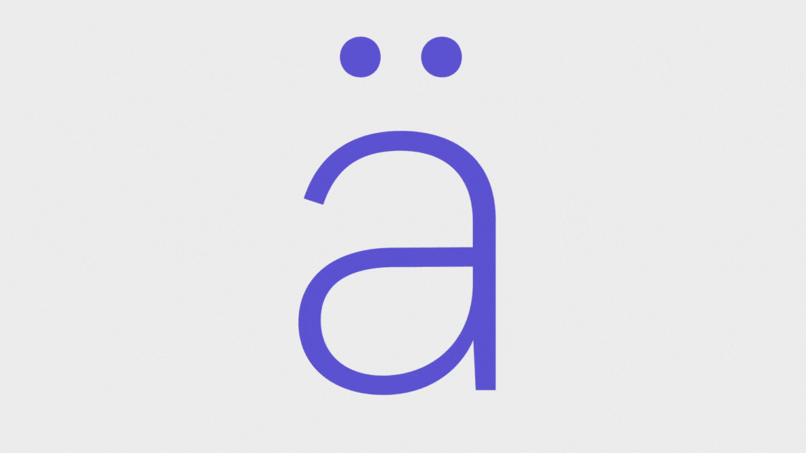
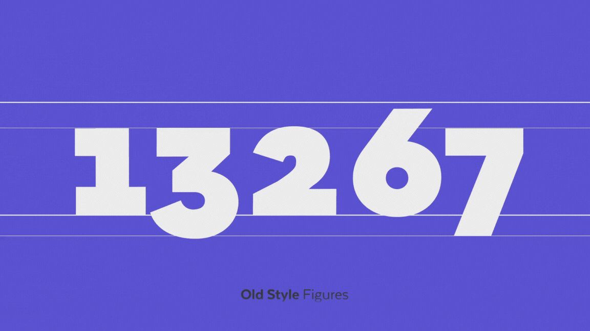
El enfoque de Burabo Studio fue capturar y expresar la fusión del rigor suizo con la vivacidad latina, elementos clave en la identidad de Baloise. El equipo logró esto a través de animaciones fluidas y estéticamente refinadas, que complementaron perfectamente las fuentes Baloise Create Headline y Baloise Create Text desarrolladas por Latinotype.
──────────────────────
ENG
We had the privilege of being in charge of the motion graphics design for the presentation video of Baloise's new typography, a prominent Swiss multinational insurance company. This project represented an exciting challenge and a unique opportunity for the studio, allowing them to demonstrate their skill in creating impactful and elegant visual narratives.
We had the privilege of being in charge of the motion graphics design for the presentation video of Baloise's new typography, a prominent Swiss multinational insurance company. This project represented an exciting challenge and a unique opportunity for the studio, allowing them to demonstrate their skill in creating impactful and elegant visual narratives.
Burabo Studio's approach was to capture and express the fusion of Swiss rigor with Latin vivacity, key elements in Baloise's identity. The team achieved this through fluid and aesthetically refined animations, which perfectly complemented the Baloise Create Headline and Baloise Create Text fonts developed by Latinotype.

ESP
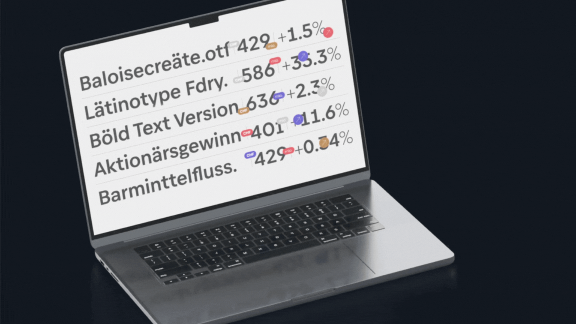
A través de nuestro trabajo en Burabo Studio, no solo resaltamos los valores de confianza, seriedad y efectividad de la marca, sino que también logramos representar la naturaleza racional pero accesible de Baloise. El estudio empleó gráficos en movimiento que reflejaban la solidez y ligereza de la tipografía, creando una experiencia visual coherente y atractiva que realzó la identidad y personalidad de la marca. Este proyecto fue una clara demostración de la capacidad de Burabo Studio para integrar arte, diseño y tecnología, ofreciendo una pieza de gráficos en movimiento que no solo sirvió como una herramienta de marketing, sino que también se convirtió en una expresión artística de la marca.
A través de nuestro trabajo en Burabo Studio, no solo resaltamos los valores de confianza, seriedad y efectividad de la marca, sino que también logramos representar la naturaleza racional pero accesible de Baloise. El estudio empleó gráficos en movimiento que reflejaban la solidez y ligereza de la tipografía, creando una experiencia visual coherente y atractiva que realzó la identidad y personalidad de la marca. Este proyecto fue una clara demostración de la capacidad de Burabo Studio para integrar arte, diseño y tecnología, ofreciendo una pieza de gráficos en movimiento que no solo sirvió como una herramienta de marketing, sino que también se convirtió en una expresión artística de la marca.
ENG
Through our work at Burabo Studio, we not only highlighted the brand's values of trust, seriousness, and effectiveness but also managed to represent Baloise's rational yet accessible nature. The studio employed motion graphics that reflected the solidity and lightness of the typography, creating a coherent and attractive visual experience that enhanced the brand's identity and personality.
Through our work at Burabo Studio, we not only highlighted the brand's values of trust, seriousness, and effectiveness but also managed to represent Baloise's rational yet accessible nature. The studio employed motion graphics that reflected the solidity and lightness of the typography, creating a coherent and attractive visual experience that enhanced the brand's identity and personality.
This project was a clear demonstration of Burabo Studio's ability to integrate art, design, and technology, offering a piece of motion graphics that not only served as a marketing tool but also became an artistic expression of the brand.
Client Latinotype / Baloise
Creative direction by Daniel Hernandez & Luciano Vergara
Creative direction by Daniel Hernandez & Luciano Vergara
Type design by Alfonso García & Cesar Araya
Art direction & graphic design by Nicolás Tobar
Motion graphics by Jonathan Bravo T.
Music by Pedro Santa Cruz